
The name is the strategy
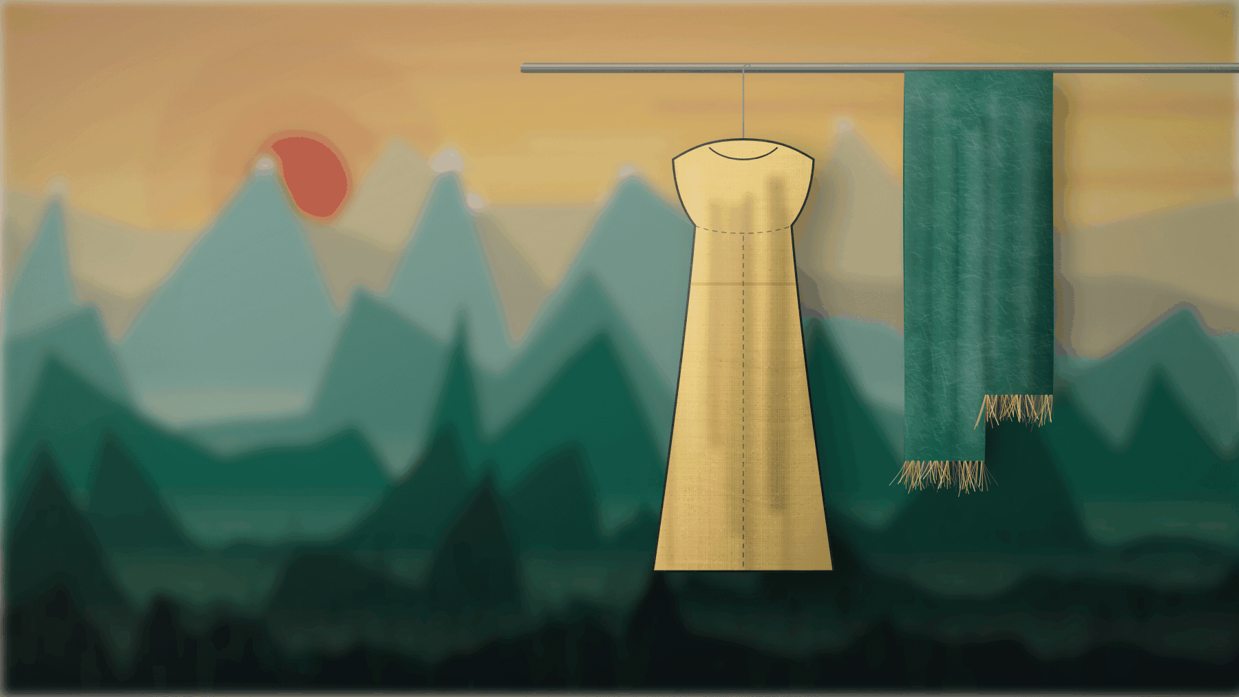
FRANS is the Swedish form of Franciscus. It is also the Swedish word for the finish on a scarf, the handmade detail that shows somebody has woven something. ANDRÉ is the Latin half: Andrés, Bogotá, Medellín, Cartagena.
Two names, one person, two worlds. Three things follow directly from that, and those decisions governed everything else.
- The first collection is scarves
- Not because it is the easiest, though it is, but because the name means fringe. It is the only launch where the product and the name say the same thing.
- The fringe is the signature
- It is in the monogram, it is physically present on the garments where it can be, and it is what makes a garment recognisable at ten metres. No logo at chest height.
- The split is the design principle
- The wordmark has a saffron hairline between FRANS and ANDRÉ. The garments have the same thing: a single coloured thread in an otherwise Nordic construction.
The colour inheritance
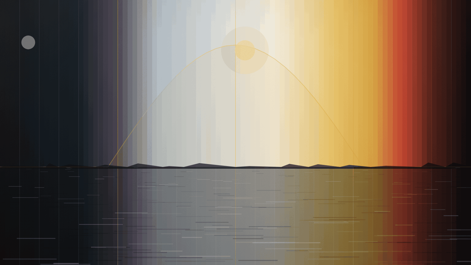
The Swedish flag is blue and yellow. The Colombian flag is yellow, blue and red. The two countries share exactly two colours, and Colombia adds a third.
That is not a coincidence to be exploited. It is a colour strategy already proven in two national identities, and it gives the brand a chromatic inheritance no competitor can take without taking the whole story.
| Group | Share | Role |
|---|---|---|
| Base: charcoal, ice, pearl, iron | 80 % | The Nordic structure. Cut, proportion, weight. |
| Shared chromatics: meridian, saffron | 15 % | What Sweden and Colombia have in common. |
| Latin accent: guacamaya, esmeralda, cartagena | 5 % | Colombia's third colour. Only where it does the work. |
A garment that breaks the distribution has to have a reason that can be written down.
The line that must not be crossed
Colombian textile tradition is living cultural heritage, not a picture library. The mochila wayuu, the sombrero vueltiao and molas are expressions belonging to indigenous peoples, and copying their forms is theft regardless of intent.
We take colour logic and rhythm. We do not take motifs, symbolism or construction. The form in our patterns is Scandinavian: square grid, cross-stitch geometry, right angle. That is why the pattern is called Chumbe Nórdico and not Chumbe.
If we ever want to use an actual traditional expression it happens only as a paid collaboration with a cooperative, with the weaver named, royalties and a contract. This is written into every brief to every designer.
What we are not
- Not a sustainability brand that happens to sell clothes. Sustainability is a baseline and is built in, but it is not the main argument.
- Not a gadget brand. Nobody buys a jacket because it has a sensor.
- Not cheap. Premium with evidence, not volume.
- Not an AI brand. AI and robotics are Gaddr's competence and our production advantage, not our sales pitch.