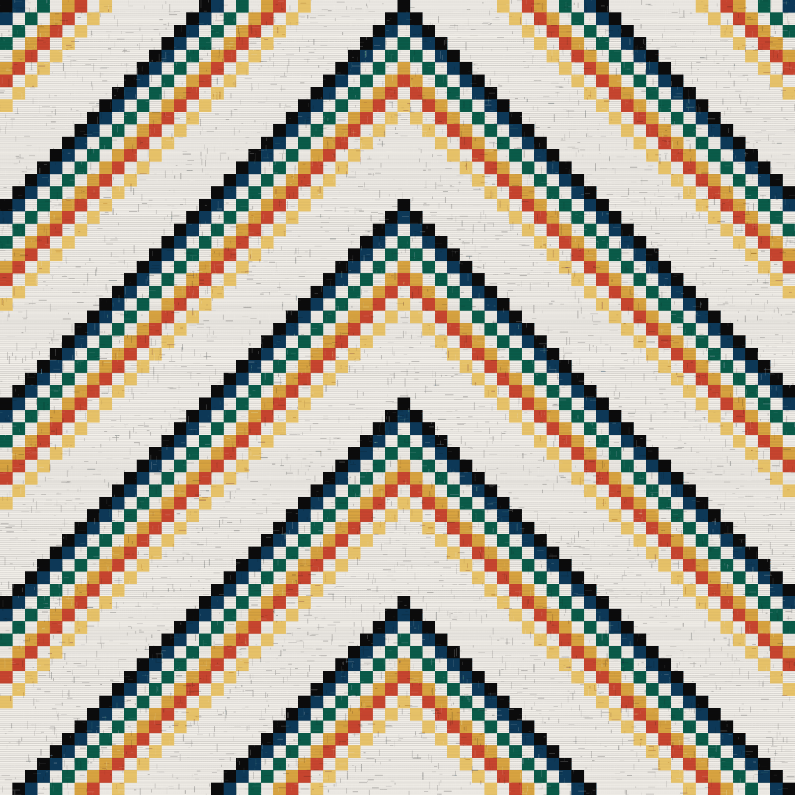
We went through the ranges of the twelve Nordic premium brands closest to our position. Eleven of them have a palette that fits inside beige, black, grey, navy and one occasional seasonal colour. The twelfth has red, in one product, once a year.
That is neither an accident nor a mistake. Neutral colours sell more safely, are returned less and age better in stock. It is a rational choice for each of them, and together it leaves a field empty.
What the emptiness is worth
A brand is remembered through one of three things: a shape, a name or a colour. The shape requires a silhouette nobody else has, and it is expensive to protect. The name requires a media budget. The colour only requires the nerve to hold on to it.

Our colour signature is not that everything is saturated. It is that eighty per cent is Nordic base and that the last twenty per cent is always there, in the same tones, in every collection.
| Share | Role | Colours |
|---|---|---|
| 80 % | Nordic structure | charcoal, ice, pearl, iron |
| 15 % | Shared chromatics, what Sweden and Colombia have in common | meridian, saffron |
| 5 % | Latin accent | guacamaya, esmeralda, cartagena |
Why these
Sweden and Colombia share exactly two colours in their flags: blue and yellow. That is not something we invented, it is an observation that became a rule of distribution.
Colombia adds a third, the red. It became guacamaya, after the macaw, and it is used where it does the work: a seam, a pick in the weave, a lining. Never as a full surface.
Structure that is Scandinavian
The colour is the Latin American half. The form is the Nordic one: square grid, right angle, large emptiness. Our five textile patterns are built on a grid and not on an organic curve, even where they carry Colombian names.
It is the contrast that is the brand, not either half. A brand that were only saturated would have become a holiday collection. One that were only structured would have become another Nordic beige.
What can go wrong
Two things. One is that the colour becomes decoration, applied afterwards because a collection feels dull. The other is cultural borrowing without grounds, taking a pattern from a tradition we have no claim to.
Against the first there is the rule of distribution. Against the second there is a harder rule: the form in our patterns is Scandinavian and the names are descriptive, not borrowed from a specific indigenous tradition. Where we work with Colombian craftspeople we do so as a client with a contract and credit, not as inspired outsiders.
Sources
- Marknad och konkurrens, konkurrentkarta för nordiskt premium. FRANS ANDRÉ, intern dokumentation, 2026-08-05.
- Designfusion Norden och Colombia, avsnittet om kulturell inspiration. FRANS ANDRÉ, intern dokumentation, 2026-08-05.